Alright – we in the trust tree here? I know I’ve been the one to build the hype and glaze everything we’ve gotten from this movie (and James Gunn’s new DCU as a whole) up and down since it was announced – I even said I saw nothing but “green flags” for this ‘Superman’ in a blog earlier this week….
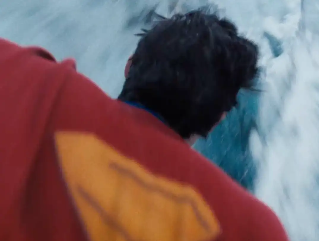
….but this teaser-for-a-teaser we got from DC Studios this morning is the first stumble or “red flag” in the marketing we’ve seen, in my opinion. I mean, I hate the idea of releasing a Tik Tok attention span level teaser-for-a-teaser in the first place, especially considering it’s our first real look at these characters – but what’s up with the look of this one?
Surely I’m not the only one who thinks it’s a bit bizarre aesthetically; like it kinda looks sitcom-y, or soap opera-y?

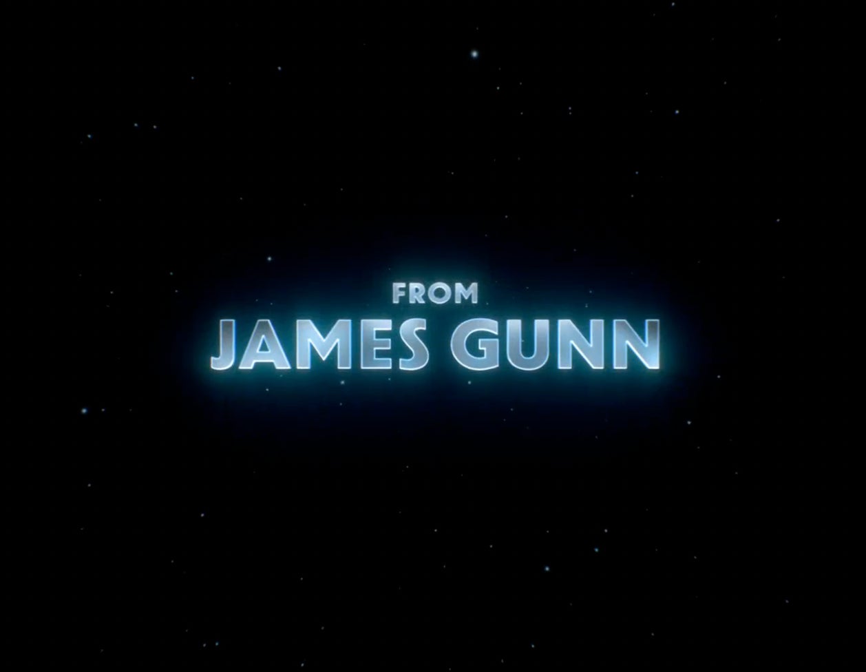
I know the Zack Snyder movies were way too dark, and we’ve been begging for color and brightness out of this new universe since the reboot was slated – but something about the saturation and contrast levels used in those shots looks CW-ish. The Daily Planet shots and Superman are okay, but the shots of Metropolis citizens staring up at the sky look like they’re from a man on the street video or something. I’m still extremely excited, but it’s the first thing that has really worried me about this movie – and this is REALLY nitpicky, but this font style just screams Star Wars….
 Again, I still have faith in tomorrow’s actual teaser trailer (which allegedly features all new footage) and the movie itself, but this was a bizarre misstep in my eyes. Not the first look at ‘Superman’ I imagined we’d get at all.

